


Complete guide to VeggiesInfo and why this website is useful for plant-based food discovery
This homepage content is written to explain what VeggiesInfo offers, why its structure matters, how its categories and tools support users, and how a cleaner premium homepage can improve both usability and search visibility.
What VeggiesInfo is and why the website matters
VeggiesInfo is a plant-based food information website built for readers who want clear, useful and organized knowledge about vegetables, nuts, seeds, spices, greens and ingredient-based food learning. Many websites publish individual food pages, but they often leave users moving from one isolated post to another without any real structure. A person may learn something about a vegetable on one page, then search again for a seed, then look somewhere else for spice information, and finally visit another site to compare foods or plan a healthier choice. That broken experience wastes time and makes food learning feel harder than it needs to be. VeggiesInfo becomes valuable because it reduces that confusion and creates a more connected way to explore plant-based content.
The strongest websites do more than store information. They help visitors understand where to begin, what they can learn, and which path makes sense for them. That is why the homepage is so important. For many users, the homepage is the first screen they see, and first impressions strongly influence whether they continue scrolling or leave. A good homepage should feel like a guide, not a random page of links. It should explain the core purpose of the website, highlight the most useful categories, introduce helpful tools and make the next step obvious. VeggiesInfo has the opportunity to become much stronger when the homepage clearly communicates that it is not only a collection of articles but also a practical discovery platform for everyday food understanding.
This matters for different types of visitors. A home cook may want practical ingredient knowledge. A student may want plant-based food learning arranged in a structured way. A health-conscious reader may be looking for nutrition values, benefits and better food ideas. A curious visitor may want to browse categories visually before opening any article. Another user may come mainly for tools such as comparison, search or food planning. When a homepage recognizes these different user goals and gives each person a useful path forward, the whole website feels smarter, more modern and more valuable.
How category browsing makes the homepage stronger
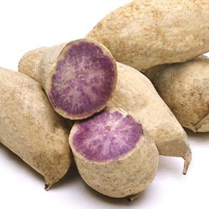
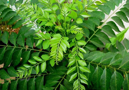
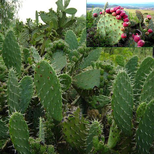
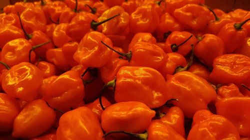
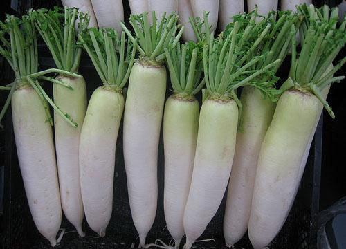
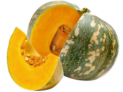
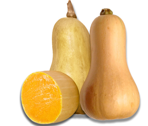
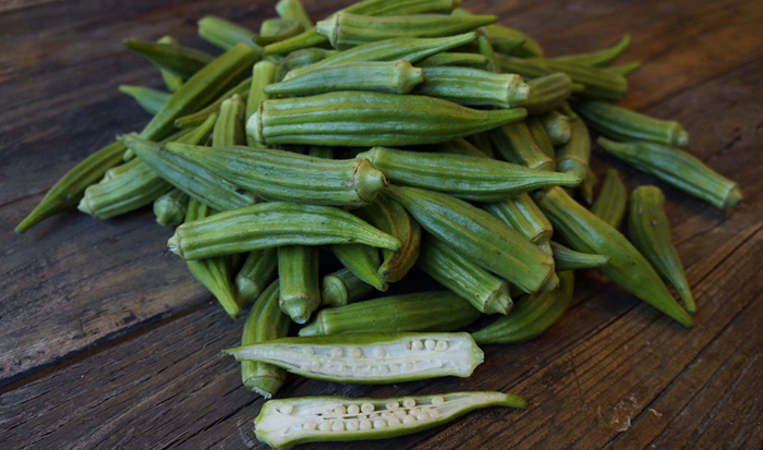
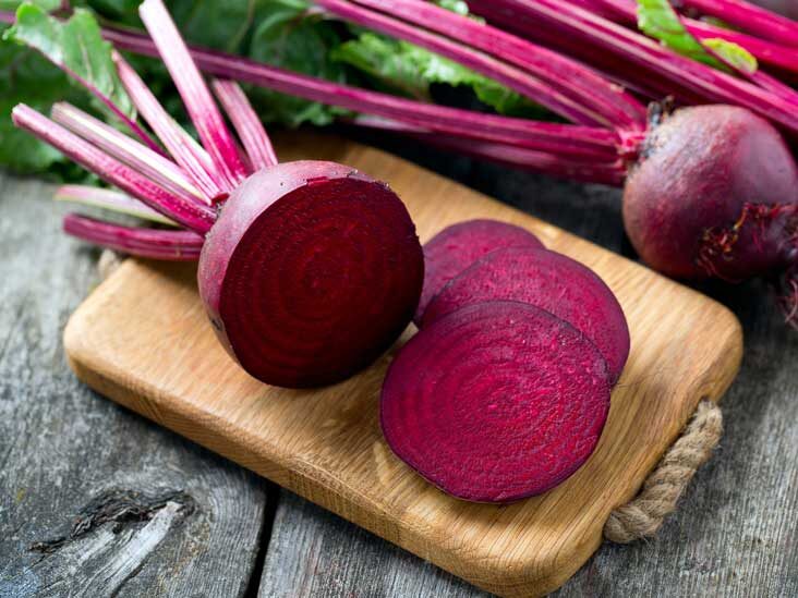
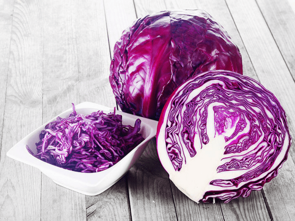
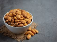
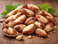
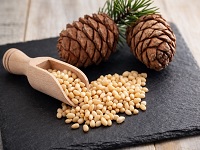
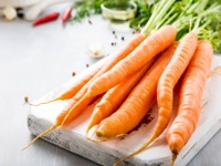
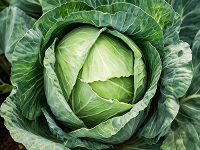
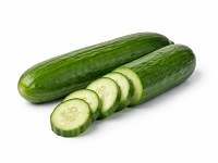
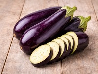
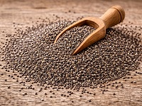
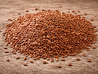
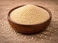
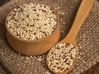
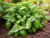
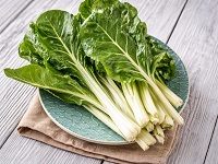
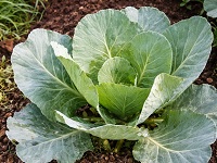
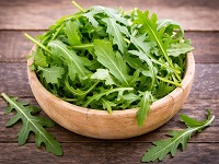
Category structure is one of the biggest strengths of a site like VeggiesInfo. Instead of forcing users to search blindly, the homepage can present a clear route into major food sections. Vegetables are central because they connect directly with daily meals, nutrition awareness and practical home cooking. Nuts are important because they suggest healthy fats, premium snacking, plant protein and nutrition-rich ingredients. Seeds represent modern healthy eating interest and support topics such as fiber, minerals and functional food use. Spices bring culinary value, traditional food identity and wellness-focused search interest. Greens create freshness, a lighter visual feeling and a strong connection with healthy everyday food choices. When these categories appear together in a structured homepage, the site feels broader and more complete.
This kind of organization also helps users browse more naturally. Someone interested in simple meal ingredients may go into vegetables first. Another person focused on nutrient-dense foods may move toward nuts and seeds. A reader who likes cooking and flavor may prefer to begin with spices. A health-focused user may be interested in greens because they often connect with freshness, mineral content and practical daily use. Category browsing is powerful because it respects how people actually explore information. Most users do not think in perfect search queries. They think by interest, familiarity, food goals and curiosity. A well-structured homepage supports that natural behavior.
Visual category cards make this even better. People recognize foods like almond, carrot, cucumber, basil or chia seeds much faster when they appear with an image, a title and a short description. That combination gives readers a quick understanding of what each section offers. It also improves internal linking because each category example can lead into a deeper page. Better internal linking helps users continue browsing, and it also supports stronger site structure overall. In that way, category browsing is not only a design feature. It is also a usability and SEO strength.
Why tools make VeggiesInfo more useful than a plain article website
One reason VeggiesInfo stands out is that it does not need to stop at article publishing. The website becomes more memorable when it also offers practical tools. A strong homepage should introduce those tools clearly because they help visitors interact with the content rather than only read it. The Compare Tool is useful because many readers want to compare plant foods side by side instead of opening several pages and trying to remember nutrition values manually. A clean comparison interface can make the website feel more helpful, especially for users who care about calories, protein, fiber, vitamin values, or category differences.
The Diet Planner Tool adds another important layer. Readers do not always want information for its own sake. Often they want guidance that helps them make a decision. A goal-based food planning tool can serve people who are thinking about balanced eating, digestion support, better variety or more practical food discovery. The Food Finder Tool is also valuable because websites with large numbers of pages need a smarter way for users to search by name, season, type or ingredient identity. The Goal Matcher Tool supports another kind of user intent by connecting goals with relevant plant-based options. Together these tools make VeggiesInfo feel active and useful rather than static.
Tools also improve engagement. A visitor who arrives for one article may stay longer if they discover a useful tool that answers a practical need. Someone reading about nuts may decide to compare them. Someone visiting a vegetable page may try a planner or food finder next. This kind of guided movement is good for the overall user experience because it turns the site into a discovery journey rather than a one-page visit. A homepage that clearly presents tools alongside categories tells users that VeggiesInfo is built not only to inform but also to help them act.
Why premium design matters on the homepage
Useful content alone does not create a premium impression. Presentation matters because design influences trust, readability and the desire to continue. If the homepage looks crowded, overly plain or visually inconsistent, readers may assume the website itself is less organized. A premium homepage does not need loud effects, heavy gradients everywhere or too many colors. In fact, the best premium design often feels calm, balanced and intentional. It uses spacing well. It lets the content breathe. It highlights important sections without overwhelming the eye. It creates a clean visual rhythm that makes long reading comfortable.
Color palette matters a lot here. Green is a natural brand color for VeggiesInfo because it connects with freshness, vegetables, health and plant-based identity. But the strongest design systems do not rely on one green everywhere. A premium palette combines rich green accents with soft cream backgrounds, warm white cards, gentle charcoal text and controlled highlights in gold or orange for action elements. This gives the homepage more depth and avoids the flat feeling that comes from repeating the same color block again and again.
Typography matters just as much. Large headlines should feel confident and clean. Paragraphs should be readable, not too tight and not too wide. A long section of homepage content must feel like a premium article, not a plain text dump. That is why modern spacing, soft visual separation, consistent heading scale and strong paragraph rhythm are so important. When those design choices are handled correctly, users stay comfortable while reading and the page immediately feels more polished.
How homepage content supports stronger SEO
The homepage is one of the most important pages on a website because it helps search engines understand the overall topic and direction of the site. For VeggiesInfo, the homepage should naturally explain that the website focuses on plant-based food information across vegetables, nuts, seeds, spices, greens and supportive food tools. When that message appears clearly in headings, paragraphs and internal links, the page becomes stronger for both users and search engines. The best SEO content is not keyword stuffing. It is useful writing that reflects real user intent while naturally including important phrases.
A homepage like this can support natural search phrases such as plant-based food information, vegetables nutrition guide, nuts and seeds information, healthy eating ideas, spices benefits, food comparison tool, diet planner tool, food finder tool and goal matcher tool. These phrases fit organically because they describe what the website really offers. Search engines reward pages that clearly express topical relevance and help users continue deeper into the site. That means a premium homepage should not only look attractive. It should also guide structure, support internal linking and communicate the main subject of the platform with clarity.
Internal links are especially important here. When the homepage links naturally to vegetable pages, nut pages, seed pages, spices, tools and featured articles, it distributes value across the website and helps users explore with less friction. That kind of structure also supports crawlability and reinforces the relationship between sections. A stronger homepage often improves the usefulness of the entire site because it becomes the main discovery layer.
Why users stay longer on a homepage like this
Users stay longer when a homepage gives them multiple reasons to continue. VeggiesInfo can achieve that by combining category browsing, featured pages, useful tools, image-based food cards and long-form explanatory content. A visitor may arrive because they searched for one food, but stay because the homepage reveals related ideas in a simple and elegant way. Someone interested in vegetable nutrition may notice a seed card, a nut category, a compare tool or a fresh update. Another person may come for a spice-related page and then continue into goal-based food discovery. The more naturally the homepage supports curiosity, the stronger the website becomes.
This also improves trust. When users see that the homepage is organized, current and thoughtfully designed, they feel more confident in the platform. Confidence matters because it influences whether readers treat the site as a source they want to revisit. A homepage that feels premium, readable and useful sends the message that the website is active and carefully built. It tells people that the information is part of a structured platform, not scattered content with no direction.
In the end, VeggiesInfo is strongest when it combines good content, clear category structure, helpful tools, visual food discovery and premium presentation in one center experience. The homepage should not feel like an afterthought. It should feel like the entry point to a larger learning system. It should make vegetables, nuts, seeds, spices and plant-based food knowledge easier to understand, easier to browse and more enjoyable to explore. That is what gives the homepage real value. It becomes more than a front page. It becomes a guide, a directory, a discovery layer and a practical foundation for the entire site.


